I was working on
Edna, my
open source note taking application that is a cross between Obsidian and Notational Velocity.
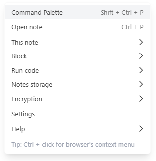
It’s written in Svelte 5 and looks like this:
While it runs in the browser, it’s more like a desktop app than a web page.
A useful UI element for desktop-like apps is a nested context menu.
I couldn’t find really good implementation of nested menus for Svelte. The only good quality library I found is
shadcn-svelte but it’s a big dependency so I decided to implement a decent menu myself.
Indecent implementations
Most menu implementations have flaws:
- verbose syntax
- not nested
- sub-menus hard to access (they go away before you can move mouse over it)
- show partially offscreen i.e. not fully visible
- no keyboard navigation
My implementation doesn’t have those flaws but I wouldn’t go as far as saying it’s a really, really good implementation.
It’s decent and works well for
Edna.
Avoiding the flaws
Verbose syntax
I find the following to be very verbose:
<Menu.Root>
  <Menu.Items>
    <Menu.Item>
      <Menu.Text>Open</Menu.Text>
      <Menu.Shortcut>Ctrl + P</Menu.Shortcut>
    </Menu.Item>
  </Menu.Items>
</Menu.Root>
That’s just for one menu item.
My syntax
My syntax is much more compact. Here’s a partial menu from
Edna:
const contextMenu = [
  ["Open note\tMod + P", kCmdOpenNote],
  ["Create new note", kCmdCreateNewNote],
  ["Create new scratch note\tAlt + N", kCmdCreateScratchNote],
  ["This Note", menuNote],
  ["Block", menuBlock],
  ["Notes storage", menuStorage],
];

const menuNote = [
  ["Rename", kCmdRenameCurrentNote],
  ["Delete", kCmdDeleteCurrentNote],
];
contextMenu is a prop passed to Menu.svelte component.
The rule is simple:
- menu is an array of
[text, idOrSubMenu] elements
text is menu text with optional shortcut, separated by tab \t- second element is either a unique integer that identifies menu item or an array for nested sub-menu
To ensure menu ids are unique I use nmid() (next menu id) function:
  let nextMenuID = 1000;
  function nmid() {
    nextMenuID++;
    return nextMenuID;
  }

  export const kCmdOpenNote = nmid();
  export const kCmdCreateNewNote = nmid();
Disabling / removing items
Depending on the current state of the application some menu items should be disabled and some should not be shown at all.
My implementation allows that via menuItemStatus function, passed as a prop to menu component.
This function is called for every menu item before showing the menu. The argument is [text, idOrSubMenu] menu item definition and it returns current menu state: kMenuStatusNormal, kMenuStatusRemoved, kMenuStatusDisabled.
When user clicks a menu item we call onmenucmd(commandID) prop function,.
We can define complex menu and handle menu actions with very compact definition and only 2 functions.
Before we address the other flaws, I need to describe how we represent menu inside the component, because this holds secret to solving those flaws.
Menu definition passed to menu component is converted to a tree represented by MenuItem class:
  class MenuItem {
    text = "";
    shortcut = "";
    /** @type {MenuItem[]} */
    children = null;
    cmdId = 0;
    /** @type {HTMLElement} */
    element = null;
    /** @type {HTMLElement} */
    submenuElement = null;
    /** @type {MenuItem} */
    parent = null;
    zIndex = 30;

    isSeparator = false;
    isRemoved = false;
    isDisabled = false;
    isSubMenu = false;
    isSelected = $state(false);
  }
A top level menu is an array of MenuItem.
text, shortcut and cmdId are extracted from menu definition.
isRemoved, isDisabled is based on calling menuItemStatus() prop function.
children is null for a menu item or an array if this is a trigger for sub-menu. isSubMenu could be derived as children != null but the code reads better with explicit bool.
parent helps us navigate the tree upwards.
zIndex exists so that we can ensure sub-menus are shown over their parents.
element is assigned via bind:this during rendering. submenuElement is for sub-menu triggers and represents the element for sub-menu (as opposed to the element that triggers showing the menu).
And finally we have isSelected, the only reactive attribute we need. It represents a selected state of a given menu item.
It’s set either from mouseover event or via keyboard navigation.
Selected menu is shown highlighted.
Additionally, for menu items that are sub-menu triggers, it also causes the sub-menu to be shown.
Implementing nesting
A non-nested dropdown is easy to implement:
- the dropdown trigger element is
position: relative
- the child, dropdown content (i.e. menu), is
position: absolute, starts invisible (display: none) and is toggled visible either via css (hover attribute) or via JavaScript
Implementing nesting is substantially more difficult.
For nesting we need to keep several sub-menu shown at the same time (as many as nesting can go).
Some menu implementations render sub-menus as peer elements. In my implementation it’s a single element so I have a only one onmouseover handler on top-level parent element of menu.
There I find the menu item by finding element with role menuitem. I know it corresponds to MenuItem.element so I scan the whole menu tree to find matching MenuItem object.
To select the menu I use a trick to simplify the logic: I unselect all menu items, select the one under mouse and all its parents.
Selecting MenuItem happens by setting isSelected reactive value.
It causes the item to re-render and sets is-selected css class to match isSelected reactive value, which highlights the item by changing the background color.
The following behavior is common and very frustrating:
- you hover over sub-menu trigger, which cases sub-menu to show up
- you try to move a mouse towards that sub-menu but the mouse leaves the trigger element causing sub-menu to disappear
There are some clever solution to this problem but I found it can be solved quite simply by:
- delaying hiding of sub-menu by 300 millisecond. That gives the user enough time to reach sub-menu before it disappears
- showing sub-menu partially on top of its parent. Most implementations show sub-menus to the right of the parent. This reduces the distance to reach sub-menu
Specifically, my formula for default sub-menu position is:
.sub-menu-wrapper {
  left: calc(80% - 8px);
}
so it’s moved left 20% of parent width + 8px.
Context menu is shown where the mouse click happened. If mouse click happened near the edge of the window, the menu will be partially offscreen.
To fix that I have aensurevisible(node) function which checks the position and size of the element and if necessary repositions the node to be fully visible by setting left and top css properties.
I use it as an action for top-level menu element and call manually on sub-menu elements when showing them.
For this to work, the element must have position: absolute.
Implementing keyboard navigation
To implement keyboard navigation I handle keydown event on top-level menu element and on ArrowUp, ArrowDown, ArrowLeft and ArrowDown I select the right MenuItem based on currently selected menu items.
Tab works same as ArrowDown and selects the next menu item.
Enter triggers menu command.
Recursive rendering with snippets
This is actually my second Svelte menu implementation. The first one was in Svelte 4 made for notepad2.
Nested menu is a tree which led me to re-cursive rendering via <svelte:self> tag.
However, this splits the information about the menu between multiple run-time components.
Keyboard navigation is hard to implement without access to the global state of all menu items, which is why I didn’t implement keyboard navigation there.
With Svelte 5 we can mount a single Menu component and render sub-menus with recursive snippets.
Keyboard shortcuts
Menu.svelte only shows keyboard shortcuts, you have to ensure that the shortcuts work somewhere else in the app.
This is just as well because in Edna some keyboard shortcuts are handled by CodeMirror so it wouldn’t always be right to have menu register for keyboard events and originate those commands.
You can use it
I didn’t extract the code into a stand-alone re-usable component but you can copy Menu.svelte and the few utility functions it depends on into your own project.
I use tailwindcss for CSS, which you can convert to regular CSS if needed.
And then you can change how you render menu items and sub-menus.
Potential improvements
The component meets all the needs of
Edna, but more features are always possible.
It could support on/off items with checkmarks on the left.
It could support groups of radio items and ability to render more fancy menu items.
It could support icons on the left.
It could support keyboard selection similar to how Windows does it: you can mark a latter in menu text with & and it becomes a keyboard shortcuts for the item, shown as underlined.
Figma used to have a search box at the top of context menu for type-down find of menu items. I see they changed it to just triggering command-palette.
References
- Edna is a note-taking application for programmers and power users written in Svelte 5
- you can see the full implementation (and use in your own projects)