CodeMirror 6 has @codemirror/search package which provides UI for searching within a document, triggered via Ctrl + F.
In my note-taking application
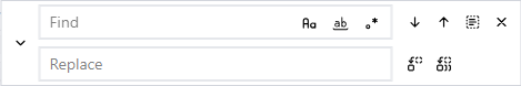
Edna I wanted something slightly different.
This article describes how I implemented it.
The UI went from:

to:
CodeMirror is very customizable which is great, but makes it hard to understand how to put the pieces together to achieve desired results.
Almost all of the work is done in @codemirror/search, I just plugged my own UI into framework designed by the author of CodeMirror.
How to get standard search UI in CodeMirror
When creating CodeMirror we configure it with:
import {
  highlightSelectionMatches,
  searchKeymap,
} from "@codemirror/search";

EditorState.create({
  // ... other stuff
  extensions: [
    // ... other stuff
    highlightSelectionMatches(),
    keymap.of([
      // ... other stuff
    ...searchKeymap,
    ]),
  ]
})
searchKeymap is what registers
key bindings like
Ctrl + F to invoke search UI,
F3 to find next match etc.
highlightSelectionMatches is an extension that visually highlights search matches.
Customizing the UI
CodeMirror 6 has a notion of UI panels. Built-in search UI is a panel.
Custom search UI panel
Thankfully panel is as generic as it can be: it’s just a div hosting the UI.
The author predicted the need for providing custom search UI so it’s as easy as adding search extension configured with custom search panel creation function:
import {
  search,
} from "@codemirror/search";

function createFindPanel() { ... }

EditorState.create({
  // ... other stuff
  extensions: [
    // ... other stuff
    search({
      createPanel: createFnddPanel,
    }),
  ]
})
Create the panel
Function that creates the panel returns a DOM element e.g. a <div>. You can create that element using vanilla JavaScript or using a framework like Svelte, React, Vue.
For Svelte the trick is to manually instantiate the component.
I use Svelte 5 so I’ve created Find.svelte component which floats over the editor area thanks to position: fixed.
Here’s how to manually mount it:
import Find from "../components/Find.svelte";
import { mount } from "svelte";

function createFnddPanel(view) {
  const dom = document.createElement("div");
  const args = {
    target: dom,
    props: {
      view,
    },
  };
  mount(Find, args);
  return {
    dom,
    top: true,
  };
}
If you provide createPanel function, @codemirror/search will call it to create search UI instead of its own. It’s a great design because it reuses most of the code in @codemirror/search.
The UI can be triggered programmatically, by calling openSearchPanel(EditorView) (and closed with closeSearchPanel(EditorView). Or By Mod + F key binding defined in searchKeymap. You can change the binding by not including searchKeymap and instead provide your own array of bindings to functions from @codemirror/search.
By default CodeMirror shrinks the editor area to host the UI. It can host it either at the top or the bottom of the editor, which is what top value indicates.
In my case value of top doesn’t matter because my UI floats on top of editor with position: fixed and z-index: 20. We don’t shrink the editor area.
The panel DOM is hosted inside this structure:
<div class="cm-panels cm-panels-top" style="top: 0px;">
  <div class="cm-panel">
    <!-- YOUR DOM ELEMENT -->
  </div>
</div>
My CSS provided with EditorView.theme() was:
const themeBase = EditorView.theme({
    ".cm-panels .cm-panel": {
      boxShadow: "0 0 10px rgba(0,0,0,0.15)",
      padding: "8px 12px",
    },
  });
The padding made the wrapper element visible even though I didn’t want it. To fix it I simply changed it to:
  EditorView.theme({
    ".cm-panels .cm-panel": {
    },
  });
Doing the searches
When user changes the text in input field, we need to tell CodeMirror 6 to execute the search.
To start a new search:
import {
	SearchQuery,
	setSearchQuery,
} from "@codemirror/search";

let query = new SearchQuery({
  search: searchTerm,
  replace: replaceTerm, // if you're going to run replacement commands
  caseSensitive: false,
  literal: true,
});
view.dispatch({
  effects: setSearchQuery.of(query),
});
CodeMirror 6 supports regex search, matching case, matching only whole world option. See
SearchQuery docs.
To instruct CodeMirror to navigate to next, previous match etc. we call:
findNext : advance to next match in the editorfindPrevious : go to previous matchreplaceNext : replace next matchreplaceAll : replace all matches
All those function take EditorView as an argument and act based on the last SearchQuery.
Doing it in Svelte 5
Here’s the core of the component:
  <div class="flex">
    <input
      bind:this={searchInput}
      type="text"
      spellcheck="false"
      placeholder="Find"
      bind:value={searchTerm}
      class="w-[32ch]"
      use:focus
      onkeydown={onKeyDown}
    />
    <button onclick={next} title="find next (Enter}">next</button>
    <button onclick={prev} title="find previous (Shift + Enter)">prev </button>
    <button onclick={all} title="find all">all </button>
  </div>
  <div class="flex">
    <input
      type="text"
      spellcheck="false"
      placeholder="Replace"
      bind:value={replaceTerm}
      class="w-[32ch]"
    />
    <button onclick={replace}>replace</button>
    <button onclick={_replaceAll} class="grow">all</button>
  </div>
We do “search as you type” by observing changes to searchTerm input field:
  $effect(() => {
    let query = new SearchQuery({
      search: searchTerm,
      replace: replaceTerm,
      caseSensitive: false,
      literal: true,
    });
    view.dispatch({
      effects: setSearchQuery.of(query),
    });
  });
On button press we invoke desired functionality, like:
  function next() {
    findNext(view);
  }
When we show search UI it’s nice to pre-populate search term with current selection. It’s as easy as:
import {
  getSearchQuery,
} from "@codemirror/search";
let query = getSearchQuery(view.state);
searchTerm = query.search;
This must be done on component initialization, not in onMount().
As addition trick, we select the content of input field:
onMount(() => {
  tick().then(() => {
    searchInput.select();
  });
});
Closing search panel on Esc
I wanted to hide search UI when Escape key is pressed. Thankfully we get searchPanelOpen(EditorView) function that tells us if search panel is open and closeSearchPanel(EditorView) to close. So it’s as easy as:
function onKeyDown(ev) {
  if (ev.key === "Escape") {
    let view = getEditorView();
    if (view && searchPanelOpen(view.state)) {
      closeSearchPanel(view);
      return;
    }
  }
}
Customizing the look of search matches
CodeMirror 6 is built on web technologies so the way it allows customizing the look of things is by applying known CSS styles. You provide your own CSS to change the look of things.
Here’s the CSS for search matches:
<!-- this is how all matches are highlighted -->
<span class="cm-searchMatch"><span class="cm-selectionMatch">another</span></span>

<!-- this is how currently selected match is higlighted.
     It changes with findNext() / findPrevious() / selectMatches() -->
<span class="cm-searchMatch cm-searchMatch-selected">another</span>
When I started working on this I did not know any of the above. Here’s my strategy for figuring this out.
Look at the source code
We live in open source world. The code to @codemirror/search is available so the first step was to look at it to see exported APIs etc.
Look at the docs
Ok, not really. I knew so little that even though CodeMirror has extensive documentation, I just couldn’t figure out how to put the pieces together.
Ask omniscient AI
I saw that there is setSearchQuery API but I didn’t know how to use it.
I asked
Grok:
how to use setSearchQuery from @codemirror/search package in codemirror 6It gave me a good response.
Look at the code again
So I tried sending new SearchQuery to the editor and it didn’t work i.e. I didn’t see the matches highlighted.
Back to reading the code and I see that in searchHighlighter higlight() function, it doesn’t do anything if there’s no panel. But I want my own UI, not their panel, so hmm…
See how others did it
Surely there must be some open source project that did something similar.
The trick is to find it. I used GitHub code search to look for distinct APIs, which is harder than it looks. If you search for findNext you’ll be flooded with results.
I found a few projects that created custom search UIs and that gave me enough hints on how to use the APIs and how to put all the available pieces together.
Resources